The Setup
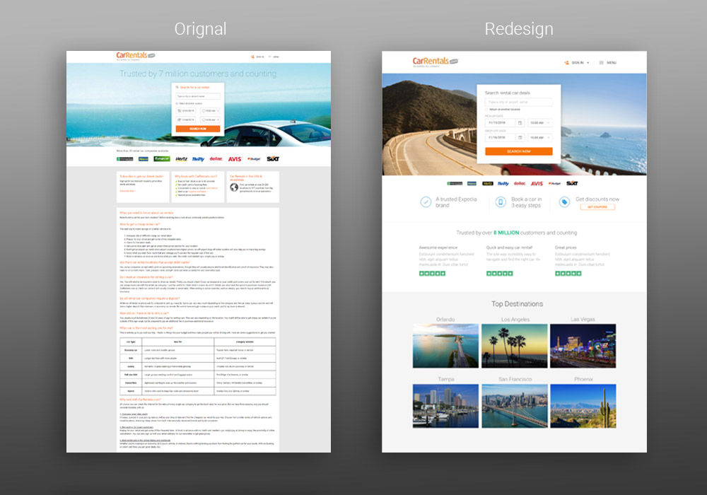
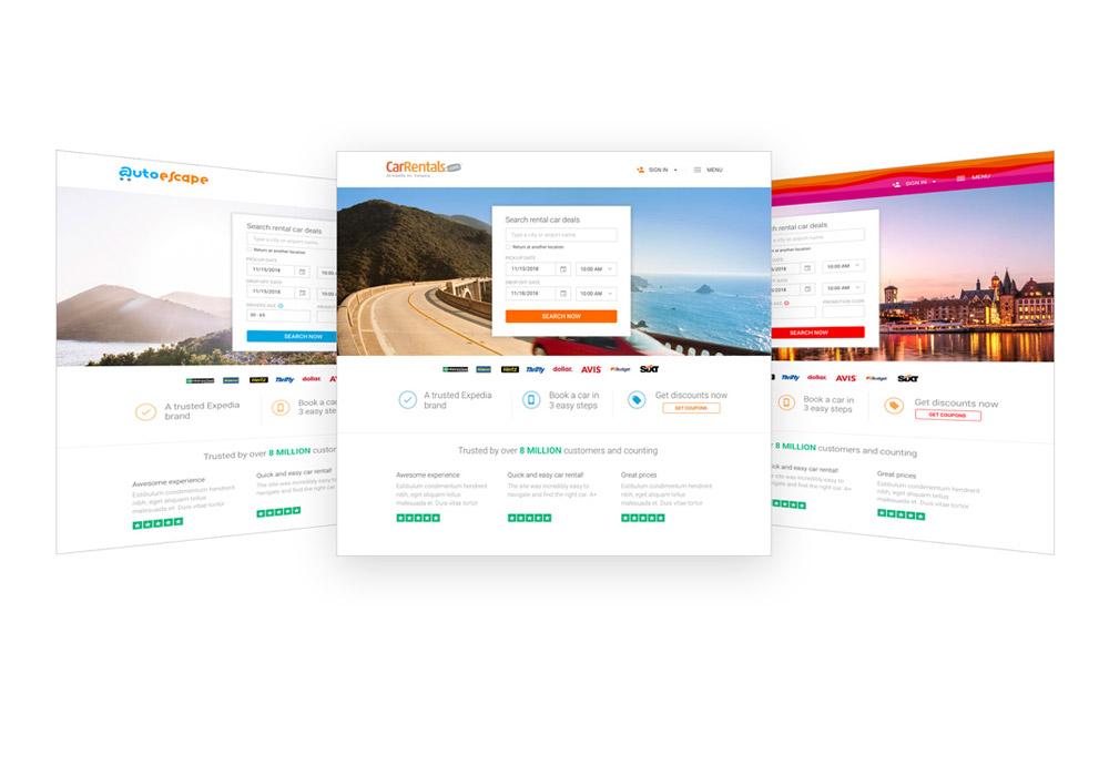
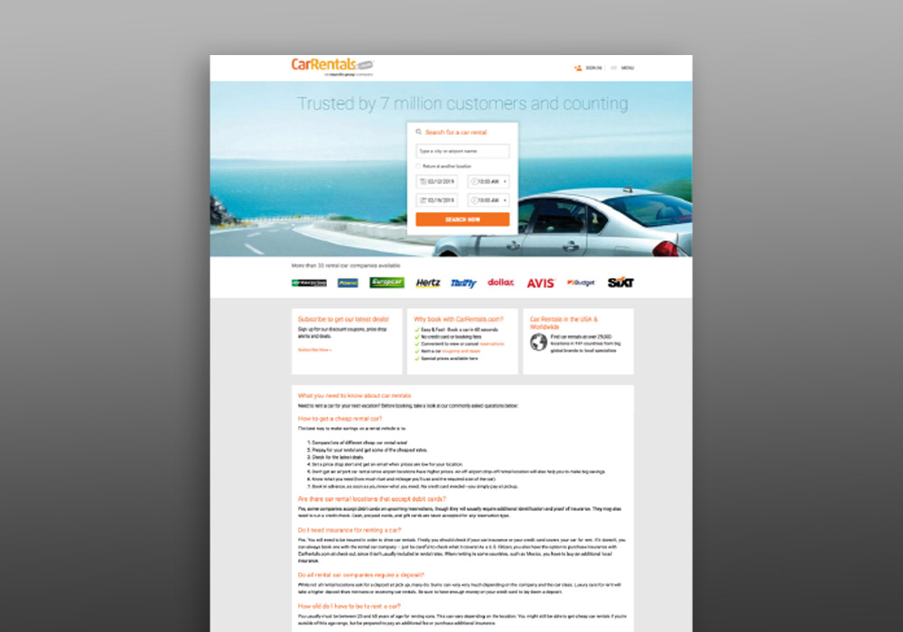
Homepage redesign for CarRentals.com (Expedia). The homepage had not been updated in several years and was very text-heavy. It lacked overall focus and visual appeal. The objective was to make it more aesthetically pleasing and improve customer confidence through focused messaging and adding customer reviews. Part of this project included bringing our French (AutoEscape.com) and German (CarDelMar.com) sites onto the same design.
The Approach
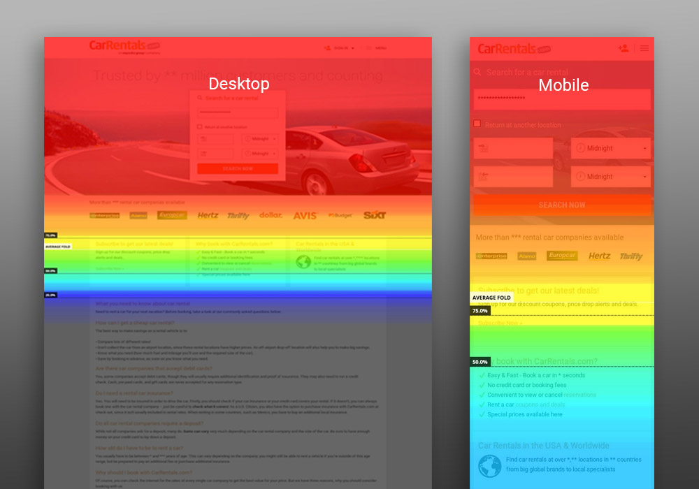
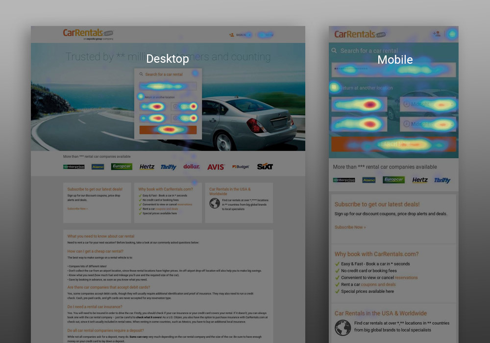
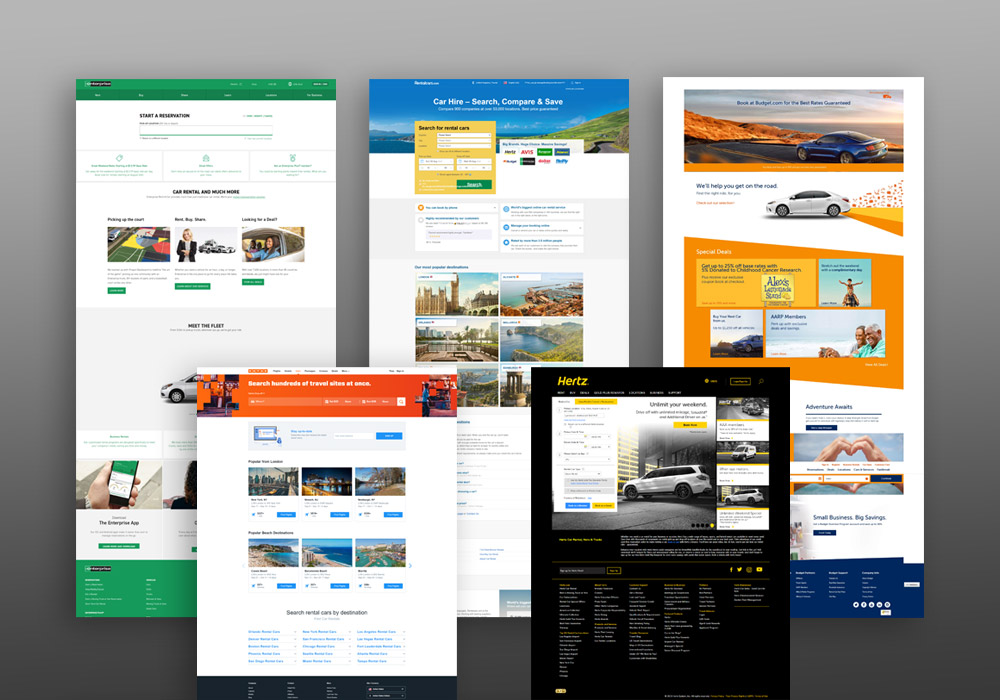
I started the process by looking at heat and scroll maps of our existing site and session recordings. These tools were beneficial to help me understand where customers were dropping off the page, what elements they were interacting with the most and any issues in the UI where they may be getting stuck. I determined that customers were dropping off on desktop once they scrolled past the fold and that they were trying to click on portions of the text that were not links. Armed with some great insights into customer behavior on the page, I started doing some competitive analysis.
The Solution
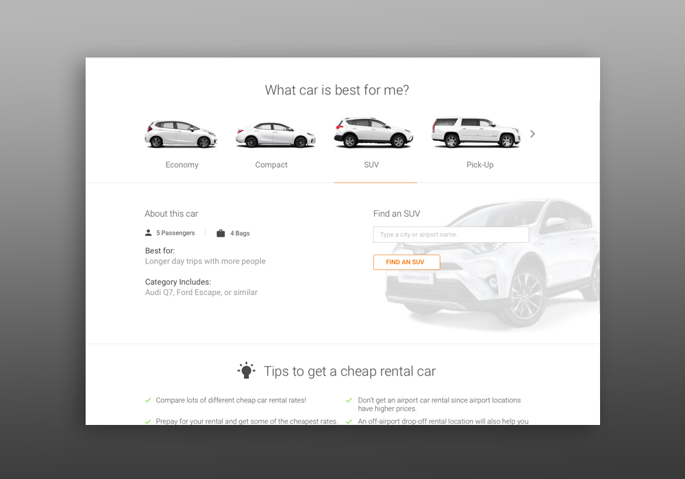
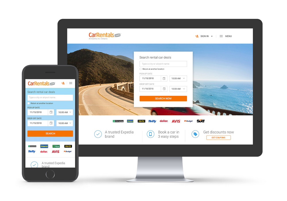
Through updating the hero image, consolidating text, and adding customer reviews, the new design addressed some customer pain points and brought the site up to a more modern aesthetic. Many other small changes such as only using the CTA color on links and adding an interactive carousel for finding a car type, really helped improve the customer experience and make the page more engaging.